10 Things You Didn’t Know About Koren
-
Koren is Not a New Company – We’ve Been Around Since 1961!
Koren Publishers Jerusalemis an Israeli publisher of Jewish religious texts established in 1961 byEliyahu Koren, with the aim of publishing the firstHebrew Bibledesigned, edited, printed, and bound by Jews in nearly 500 years. We produced
The Koren Bible in 1962. The Tanakh's textual accuracy, pioneering design and superior quality won it worldwide acclaim. The Koren
Siddur came out nearly 20 years after The Koren Bible in 1981. The siddur featured a newly designed font and an insightful graphic layout. More recently TheKoren Sacks Siddur was releasedin 2009, in addition to numerous editions of these books and other religious texts in Hebrew, English, and other languages.

-
Koren Jerusalem Bible Featured on Israeli Postal Stamp
On 12/12/12, otherwise known as December 12, 2012, the Israel Postal Authority issued an official postage stamp honoring the 50
th anniversary of the Koren Jerusalem Bible. Its 12/12/12 release date is a prestigious honor in the world of stamp collection.
The Israel Postal Authority commended the Koren Jerusalem Bible for “epitomizing the revival of Jewish texts in the homeland of the Jewish people.”

Found on the stamp is a quote from the former speaker of the Knesset, Kadish Luz. After the publication of The Koren Bible in the 1960’s, Luz declared, "From this day forth all of Israel’s presidents shall take their oaths of office upon this Bible. We have been governed by a Provisional State Council, a Provisional Government and even now sit in the temporary Knesset building. To date, Israeli presidents have been sworn in using a temporary edition of the Bible. This occasion symbolizes our overcoming of foreign heritage and return to our origins."
David Ben Gurion himself simply exclaimed, "Israel is redeemed from shame!"
-
Eliyahu Koren Developed a Unique Font for The Koren Bible
The President of TheHebrew UniversityofJerusalemasked Koren to create a new font for an entirely new edition of the HebrewBiblethat he sought to publish under the University's auspices during World War II. A design competition was held, and Koren's font won.

The font was based on the Moshe Ben-Asher Codex of the Prophets manuscript, belonging to theKaraitecommunity in Cairo, the earliest medieval manuscript with a publisher’s emblem, written in 895 CE.
Koren set out to design the most readable Hebrew font possible. He consulted an ophthalmologist, who shared with him research conducted on the legibility of Latin book types. Koren made clear distinctions between similar letters such as bet and kaf, gimel and nun, dalet and resh. He believed that each letter should be recognizable even if only its top 1/3 were visible. He also believed that designers should learn from the earliest printers and typographers, who

based their fonts on fine handwriting.
Special care was used to restore the authenticity of the original Hebrew. For instance, in the original Hebrew text some letters are written larger or smaller than usual. Others letters are upside down, suspended, broken, or specially formed. There are also places where the final forms are used in the middle of a word, and other places where dots are written over or inside specific letters. These unusual occurrences are there for a reason, and often carry deeper meanings.
The Koren Tanakh preserves all these.
-
…And Then Nearly Two Decades Later, Created a Font for the Koren Siddur

Koren created
Koren Book Type for use in theKoren Siddur.

Thus it came to be that Mr. Koren also developed a distinct but related siddur typeface, since he felt that the one he had developed for the Bible was too sacred to reuse, except for biblical quotations. This typeface was even more legible than the first and each letter clearly distinguished from similar looking letters, for example the
dalet and the
resh. Koren Type has been used in publications of Koren Publishers Jerusalem ever since, as well as in other important texts.
The Jewish Braille Institute of America has used Koren Type for books published for the partially sighted.
-
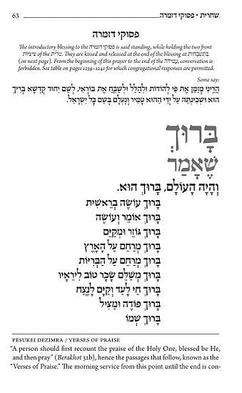
Our Siddur looks different than most. Why Hebrew on left and English on right?
Better than just having great fonts, the siddur is laid out with great elegance and care. Rather than having Hebrew on the right and English on the left, with lines of text ending in the center of the page, the Hebrew is on the left and the English is on the right, with lines of text beginning in on the spine of the siddur.
Combined with line breaks and blocks of text, and each two-page spread of the siddur is symmetrical, with the blocks of English and the blocks of Hebrew mirroring each other. The effect of the texts being read in opposite directions creates an image of wings spreading across the page.
Additionally, the siddur has an intuitive way of telling you when to bow and when to rise, etc. without adding additional text which would have crowded the page. Instead, next to words on which one is supposed to bow, there is a small triangle pointing down.

-
You May be Rushing to Get Out of Shul, but Mr. Koren Wants You to S-L-O-W Down.

Rather than allow the text to run continuously across page turns, Koren maintained lines and paragraphs within individual pages. He set individual sentences line by line, according to their meaning. The result is a siddur that allowed for uninterrupted prayer and illuminated the underlying meaning of the text. The siddur became one of the mostwidely usedHebrew siddurim. In 2009, Koren Publishers Jerusalem introduced a new Hebrew/English edition of the Koren Siddur, the
Koren Sacks Siddurwhich also included an introduction, translation, and commentary by LordJonathan Sacks.
Eliyahu Koren's philosophy regarding the siddur can be summed up in his statement that, "the prayers are presented in a style that does not encourage habit and hurry, but rather inspires the worshipper to engage both mind and heart in prayer."
-
Emblem of the city of Jerusalem

The official symbol of the city of
Jerusalemsince 1950, seen above, was designed by our founder, Eliyahu Koren. The emblem's main figure is a
lion, which represents the "
lion of Judah", the symbol of the
Tribe of Judahand later on the
Kingdom of Judah, whose capital was Jerusalem. In the background you see the
walls of Jerusalem representing the
Western Wall, and the
olive branchthat surrounds the emblem represents the quest for peace.
Shortly after the founding of the state of
Israel, the Jerusalem’s mayorbegan a design competition among graphic designers in order to make the city's first national emblem. The winning design was made by a team led by
Eliyahu Koren, then the director of the
Jewish National Fund's graphics department. The emblem is still the official symbol of Jerusalem today!
-
Eliyahu Koren Street in Jerusalem
Located in the Homat Shmuel/Har Homa neighborhood in South Jerusalem is Eliyahu Koren Street. Named after Mr. Koren 10 years after he was awarded the Jerusalem Prize, the city’s most prestigious award (1988)
Fun fact: Misrad HaPnim (The Ministry of the Interior) is located on Eliyahu Koren Street!

-
Not Just Tanakh Anymore
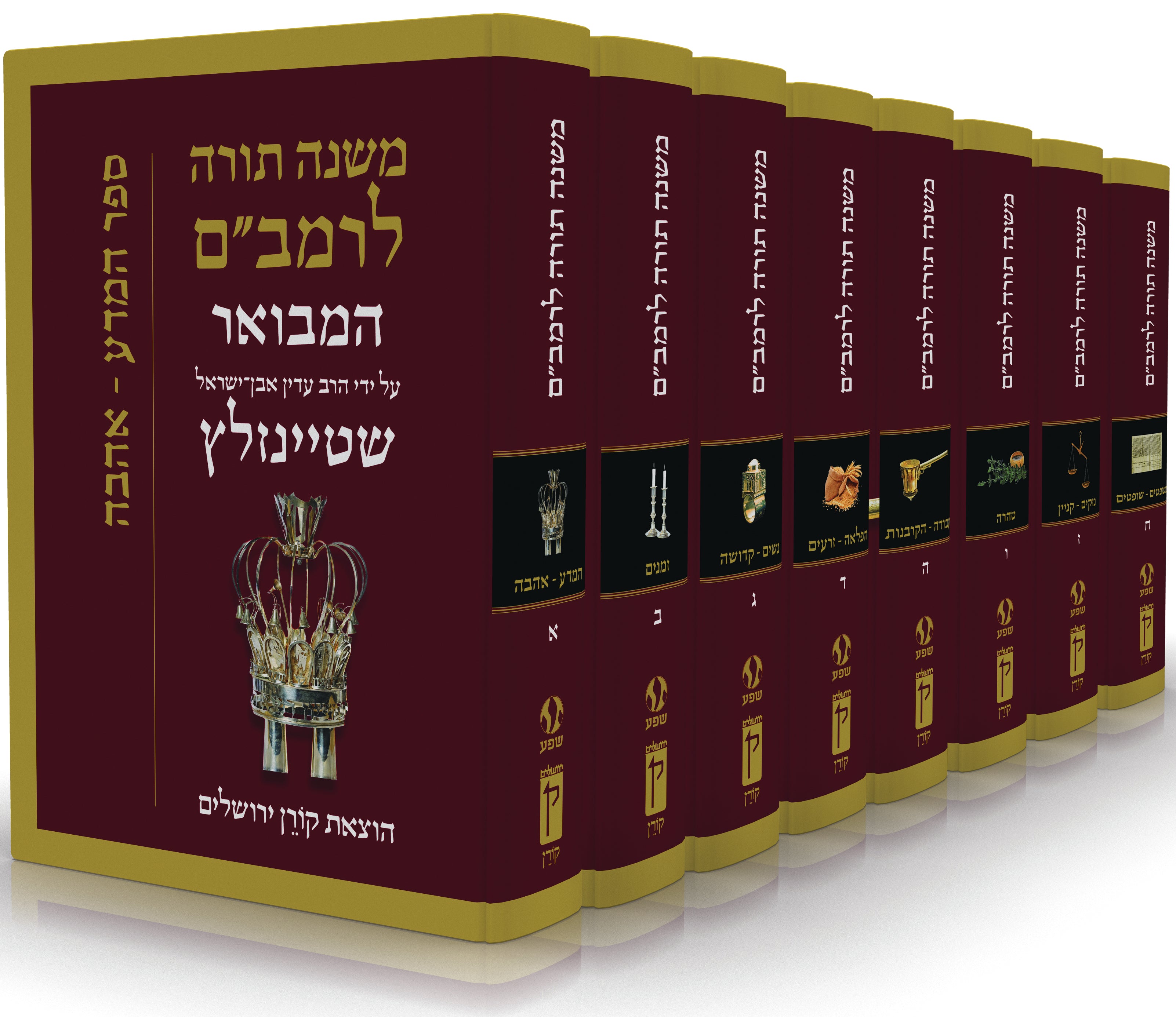
It’s true; we started with publishing the Koren Bible. It went on to be adopted by Israeli schools, municipalities, and the IDF, which awards a copy to each soldier. For decades, it was even the authoritative edition on which the President of Israel took his oath. However, since 1961Koren has expanded its collections to include the most essential books for every Jewish household including,
Mishna,
Talmud,
Rambam’s Mishneh Torah,
Tehillim,
Pirkei Avot, and more.

Not to be confused with our Koren publications, we also now house five different imprints, publishing fascinating, quality Jewish books for everyone!
Koren Publishers: Classic Jewish texts for every home, school, synagogue, and yeshivah.
Ofeq Institute: Dedicated to the research of original Hebrew medieval manuscripts.
Maggid Books: Contemporary approaches to Jewish texts and themes from the world’s leading Orthodox rabbis, scholars, and philosophers
Menorah Books: The destination for quality books addressing contemporary Jewish life and belief, while inspiring thoughtful reflection and conversation.
The Toby Press: Publishes fine writing on subjects of Israel and Jewish interest.
-
Commitment to Zionism
According to our publisher, Matthew Miller in an
interview with The Jewish Press in 2017: “We’re a halachic publisher. But in our
hashkafa, Zionism is important, the state of Israel is important, and engaging the world is important. I suppose you can say Rabbi Jonathan Sacks [the author of many Koren books, including the Koren Sacks
siddurembodies many of our values.”

One such example of our focus on the state of Israel and on Zionism is the
Koren Yom HaAtzma’utMahzor. The Mahzor is the first-ever English-Hebrew prayer book for Israel’s national holidays. It includes complete services for Israel’s Independence Day and Jerusalem Day according to the practices established by the Chief Rabbinate of Israel. The mahzor features a moving introduction by Rabbi Shlomo Riskin, translation by Rabbi Jonathan Sacks, commentary by Rabbi Moshe Taragin and Rabbi Binyamin Lau, and a unique collection of essays by other leading scholars in the world of Religious Zionism. Optional prayers such as Hallel and Al-HaNissim are shaded and include extensive notes that explain the halakhic debates surrounding their recitation.

The
Koren Yom HaAtzma’utMahzor is both an enhanced mahzor and an inspiring educational resource in one.
The Koren Mahzor isn’t the only place you see our deep connection to the Land and people of Israel. For example, The Koren Tanakh is distinctively Israeli. Produced by Israelis, published in the holy city of Jerusalem, given to every soldier upon their swearing in, and used in the oath of office taken by members of the Knesset, this Bible is a central character in the story of modern Israel.


 Found on the stamp is a quote from the former speaker of the Knesset, Kadish Luz. After the publication of The Koren Bible in the 1960’s, Luz declared, "From this day forth all of Israel’s presidents shall take their oaths of office upon this Bible. We have been governed by a Provisional State Council, a Provisional Government and even now sit in the temporary Knesset building. To date, Israeli presidents have been sworn in using a temporary edition of the Bible. This occasion symbolizes our overcoming of foreign heritage and return to our origins."
David Ben Gurion himself simply exclaimed, "Israel is redeemed from shame!"
 The font was based on the Moshe Ben-Asher Codex of the Prophets manuscript, belonging to theKaraitecommunity in Cairo, the earliest medieval manuscript with a publisher’s emblem, written in 895 CE.
Koren set out to design the most readable Hebrew font possible. He consulted an ophthalmologist, who shared with him research conducted on the legibility of Latin book types. Koren made clear distinctions between similar letters such as bet and kaf, gimel and nun, dalet and resh. He believed that each letter should be recognizable even if only its top 1/3 were visible. He also believed that designers should learn from the earliest printers and typographers, who
  based their fonts on fine handwriting.
Special care was used to restore the authenticity of the original Hebrew. For instance, in the original Hebrew text some letters are written larger or smaller than usual. Others letters are upside down, suspended, broken, or specially formed. There are also places where the final forms are used in the middle of a word, and other places where dots are written over or inside specific letters. These unusual occurrences are there for a reason, and often carry deeper meanings. The Koren Tanakh preserves all these.
 Koren created Koren Book Type for use in theKoren Siddur.
 Thus it came to be that Mr. Koren also developed a distinct but related siddur typeface, since he felt that the one he had developed for the Bible was too sacred to reuse, except for biblical quotations. This typeface was even more legible than the first and each letter clearly distinguished from similar looking letters, for example the dalet and the resh. Koren Type has been used in publications of Koren Publishers Jerusalem ever since, as well as in other important texts.
The Jewish Braille Institute of America has used Koren Type for books published for the partially sighted.

 Rather than allow the text to run continuously across page turns, Koren maintained lines and paragraphs within individual pages. He set individual sentences line by line, according to their meaning. The result is a siddur that allowed for uninterrupted prayer and illuminated the underlying meaning of the text. The siddur became one of the mostwidely usedHebrew siddurim. In 2009, Koren Publishers Jerusalem introduced a new Hebrew/English edition of the Koren Siddur, theKoren Sacks Siddurwhich also included an introduction, translation, and commentary by LordJonathan Sacks.
Eliyahu Koren's philosophy regarding the siddur can be summed up in his statement that, "the prayers are presented in a style that does not encourage habit and hurry, but rather inspires the worshipper to engage both mind and heart in prayer."
 The official symbol of the city ofJerusalemsince 1950, seen above, was designed by our founder, Eliyahu Koren. The emblem's main figure is alion, which represents the "lion of Judah", the symbol of theTribe of Judahand later on theKingdom of Judah, whose capital was Jerusalem. In the background you see thewalls of Jerusalem representing the Western Wall, and theolive branchthat surrounds the emblem represents the quest for peace.
Shortly after the founding of the state ofIsrael, the Jerusalem’s mayorbegan a design competition among graphic designers in order to make the city's first national emblem. The winning design was made by a team led byEliyahu Koren, then the director of theJewish National Fund's graphics department. The emblem is still the official symbol of Jerusalem today!

 Not to be confused with our Koren publications, we also now house five different imprints, publishing fascinating, quality Jewish books for everyone!
Koren Publishers: Classic Jewish texts for every home, school, synagogue, and yeshivah.
Ofeq Institute: Dedicated to the research of original Hebrew medieval manuscripts.
Maggid Books: Contemporary approaches to Jewish texts and themes from the world’s leading Orthodox rabbis, scholars, and philosophers
Menorah Books: The destination for quality books addressing contemporary Jewish life and belief, while inspiring thoughtful reflection and conversation.
The Toby Press: Publishes fine writing on subjects of Israel and Jewish interest.
 One such example of our focus on the state of Israel and on Zionism is the Koren Yom HaAtzma’utMahzor. The Mahzor is the first-ever English-Hebrew prayer book for Israel’s national holidays. It includes complete services for Israel’s Independence Day and Jerusalem Day according to the practices established by the Chief Rabbinate of Israel. The mahzor features a moving introduction by Rabbi Shlomo Riskin, translation by Rabbi Jonathan Sacks, commentary by Rabbi Moshe Taragin and Rabbi Binyamin Lau, and a unique collection of essays by other leading scholars in the world of Religious Zionism. Optional prayers such as Hallel and Al-HaNissim are shaded and include extensive notes that explain the halakhic debates surrounding their recitation.
 The Koren Yom HaAtzma’utMahzor is both an enhanced mahzor and an inspiring educational resource in one.
The Koren Mahzor isn’t the only place you see our deep connection to the Land and people of Israel. For example, The Koren Tanakh is distinctively Israeli. Produced by Israelis, published in the holy city of Jerusalem, given to every soldier upon their swearing in, and used in the oath of office taken by members of the Knesset, this Bible is a central character in the story of modern Israel.